Google Play Store Redesign: What’s New
 Liza Knotko
After months of testing different iterations, Google finally launches new design of their Play Store. In general, Android users are accustomed to constant minor changes of the store, but the latest redesign seems to be one of the most substantial ones over the last few years.
Let’s study out all of the changes in the updated Google Store and explain how you can adjust your app store optimization efforts to the changing tides of Google Play.
The new design of Google Play Store seems to be aimed at improving apps discoverability. Furthermore, the updated app product pages tend to provide more information without making users perform additional scrolls. What makes it possible? Let’s find out!

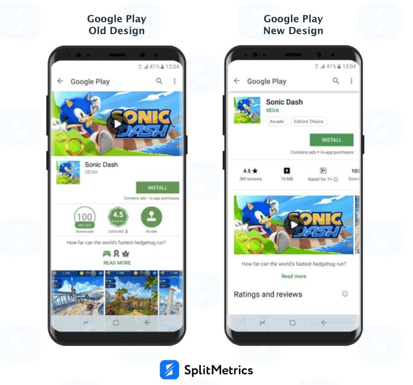
App product pages in the updated Google Play Store no longer have featured banners containing preview videos. Occupying a considerable part of product pages, this header used to be a central element in the old layout.
It’s a smart move taking into consideration that Google Play didn’t autoplay videos and the overwhelming majority of users didn’t click the ‘Play’ sign. Thus, a featured banner was turned into a dead space giving very little information about an app.
Where can you find preview videos then? Well, it found its place at the beginning of the screenshots section. Now a video preview acts as the first screenshot just like in the App Store but still without autoplay feature.
Consequently, in the redesigned version of Google Play Store, the first impression frame contains the following information:
The new Google Play layout allows users to absorb more information about the app faster. Good news for app publishers aspiring to increase their conversion rate (read: all app publishers).
App screenshots became the core element of the first impression frame with the latest Google Play Store redesign. They were moved above the fold becoming more prominent in the display.
As it was mentioned above, now screenshots slider contains a video preview. This important change to Google Play Store design has a certain peculiarity: the size (height) of screenshots gallery depends on video orientation.
If you upload a horizontal video to your app product page, the height of the whole screenshots slider will decrease adjusting to the size of the app preview.
Now Android users don’t have to scroll a product page to get a glimpse of screenshots. That’s why it’s definitely worth investing in quality screenshots set as now users are more likely to base their decision concerning an install on the look of this product page element.
So don’t waste your time and optimize your app screenshots. Running a series of A/B tests with SplitMetrics you’ll manage to nail a pitch-perfect screenshots set which entices Google Play Store visitors to install your app.
It’s no wonder that app title remained the most prominent text element of a product page. However, with the emergence of the new Google Play design, short description got a way less favourable position.
It’s still a part of the first impression frame but the post-screenshots spot will probably predetermine decreasing attention and interest towards this product page element. This change makes sense in the world where people crave visual information more and more.
It’s also a sign that your description may now become a less influential ranking factor.
Once again this update calls for thorough testing, identification of the most impactful elements and their optimization.

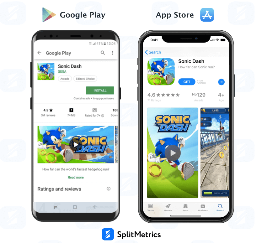
Google Play Store redesign made product pages more reminiscent of iOS App Store. Judge for yourself:
Indeed, product pages of both stores look more similar now making it so tempting to synchronize all ASO related moves. Let’s say, using screenshots optimized for Google Play in the App Store.
Please, don’t let this design resembling fool you!
Google Play Store and iOS App Store are still very different in their core. They call for different traffic sources, ranging targeting, unlike approaches to ads and positioning. Above all, the behaviour of Android and iOS users differ dramatically.
Thus, only diversifying your approaches to app store optimization for every store, you’ll be able to become a leader on both platforms.
Google Play Store redesign is yet another reason to revise your ASO activity and have a fresh start. The smart data-driven approach is a must if you aim at app store success.
Launching your Google Play experiments with SplitMetrics, you:
SplitMetrics is here to help you providing all tools needed for making the grade with a powerful app store optimization strategy.
